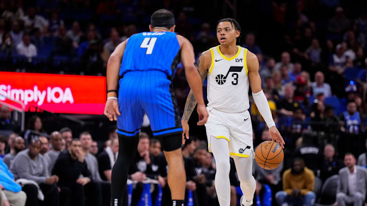
Does the Utah Jazz have an image problem? Yeah, we're not talking about how they still associate themselves with some less-than-refutable names, that's a different discussion for a different day. no, we're talking about how the Utah Jazz's look just isn't very popular. Our very own writing staff has made it clear that they're not really happy with the current logo and uniforms that the team wears.
Or the color scheme for that matter.
Yet, it hasn't been a topic of greater conversation until recently. When the Los Angeles Clippers debuted their new look, it got people talking about clubs that need a new rebranding and wouldn't you know it, the Jazz are among the top teams who need a new look.
According to CBS Sports, the Utah Jazz are the fifth-worst-looking club in the NBA when factoring in the logo, jersey designs, and color scheme. Made worse by the fact that the Jazz just overhauled their look just a couple of years ago.
The article goes on to say;
"The new color scheme is a complete departure from what we've come to expect from the Jazz, who have gone through countless jersey redesigns, and somehow their creative team landed on highlighter yellow, black and white. The Jazz are one of five teams, that have five jerseys this season, with the fifth being a "Classic Edition" which is just the John Stockton, Karl Malone era purple uniforms, and honestly that's what Utah should just revert back to. Either that one or the purple mountain range ones because those are some of the cleanest jerseys in the league past or present."
It's pretty clear that most of us both on the site and in the greater Jazz community at large aren't fans of the current look of the jersey's and the logos. It's time for the Jazz to ditch this modern-minimalist look and design something truly eye-catching. This is a pro sports team, after all, not the front entrance to a European museum.
