2. 1996-2004 Utah Jazz jersey

The 1996-2004 Jazz jerseys were emblematic of many of the jerseys of that article era: bold, unique, graphic-heavy, fun, but probably not sustainable.
The most notable aspect of this jersey is that it has a big mountain image square in the middle of it, which no other jersey in Utah Jazz history did.
Jokes aside, it’s kind of a beautiful jersey. The colors on the collar stripes are wonderful, subtle accents to an intoxicating primary purple. The Jazz logo is a little bit hokey, but again, in the mid-1990s, that was the order of the day for NBA jerseys.
Someday, the franchise could consider repurposing this look in a modern context. However, as nice as the design is, the Jazz trended away from such a cartoonish look about as quickly as the Houston Rockets, Detroit Pistons, Atlanta Hawks and others did.
Was this the best era in NBA jersey history, or was it the worst? We’re not entirely sure, but it was almost certainly the most unique.
1. 1984-1996 Utah Jazz jersey

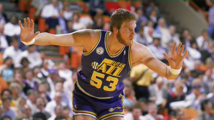
Here it is folks. The definitive jersey in Utah Jazz history.
Frankly, it’s one of the best jerseys in NBA history. Purple and yellow make for a beautiful color combination. The green is appropriately hidden as a tertiary color, adding a nice accent to the purple and yellow combo that really pops. Meanwhile, that same iconic Utah Jazz logo stands with minimal alteration, marking a quality decision to not fix something that wasn’t broken.
There are scarce-few words even needed. The image is right in front of you, so you can see it for yourself. This is the best jersey design in Jazz history.
We hope you had fun on this historic tour of Utah Jazz jersey designs. We’ll resume your regularly scheduled actual basketball discussion right after this. In the meantime, let’s hope those new jersey designs can do well in comparison to some of the looks we’ve discussed in this article.
