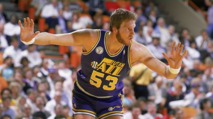
4. 1979-1984 Utah Jazz jersey

For those of us who weren’t alive in the 1970s, green has just never felt like an appropriate primary color for the Utah Jazz. There’s no logical reason why they can’t wear it, precisely. We’d just prefer if they didn’t.
This jersey did introduce the Jazz logo that’s been featured on many of their jerseys throughout history, so it does deserve credit in that regard. It’s such a nice design that it’s hardly needed alteration in 40+ years.
There also aren’t any major structural flaws in this look’s design. There are no obnoxious stripes or color splashes. It’s absolutely solid.
We just don’t like green for the Jazz OK. Maybe that’s all this one boils down to. It’s our list, we don’t need a sophisticated criteria to have an opinion.
3. 2010-present Utah Jazz jersey

In a sense, the current primary Utah Jazz jersey is a culmination of their designs throughout history. It’s got the iconic Jazz logo, the 70s green (this time, as a more fitting secondary color) and the consistently present yellow.
It loses points for being a little too busy: white, blue, green and yellow are a lot of colors to fit into a single jersey. Personally, we prefer the away jersey: the predominance of the dark blue allows the multiple colors to feature as needed accents. When the primary color is white, it looks like about one too many colors are being squeezed into the design.
A side note: this design actually did undergo some changes in 2016. The green stripe around the color of the jersey was moved to become a larger side stripe. They’re close enough that we’re grouping them together, and you can’t stop us.
