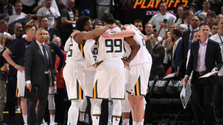
The 2017-18 Utah Jazz: An Unexpected Season
By Tyler Thorpe

The Jerseys
Full disclosure, I HATED the City Edition jerseys when the first leaks came out. Like many other fans, the design reminded me of a urine test. If I recall correctly, Nike claimed the jerseys were one of the most innovative designs they had ever worked on.
Innovative? Sure. Cool? I don’t think so.
That was until I actually saw them on the team. The Southern Utah inspired jerseys and complementary court design (complete with a silhouette of Delicate Arch) looked fantastic. Jazz fans seemed to agree as stores couldn’t restock the new-look uniforms fast enough.
Should this be the @utahjazz court full time?#uniswag pic.twitter.com/iTMh6hmPJK
— UNISWAG (@UNISWAG) May 5, 2018
Another addition to the jerseys this year was the jersey patch. Huge shout-out to Qualtrics for sponsoring the 5 For the Fight patch on Utah’s uniforms this season. For a team that did so much good on the court, it was only fitting that its jersey patch symbolized doing good off of it as well.
Throw in Utah’s above-average gold Statement jerseys, and it was a good year to rock Jazz gear.